
Up Above + Down Below for Westfield St Lukes.
THE BRIEF //
With continued upgrade works taking place, our friends at Westfield St Lukes engaged us to design a Kids Play area that would bring vibrancy and fun into the centre.
The brief was to repurpose assets created for Christmas to create a multi purpose space for families in an empty tenancy.
THE THINKING //
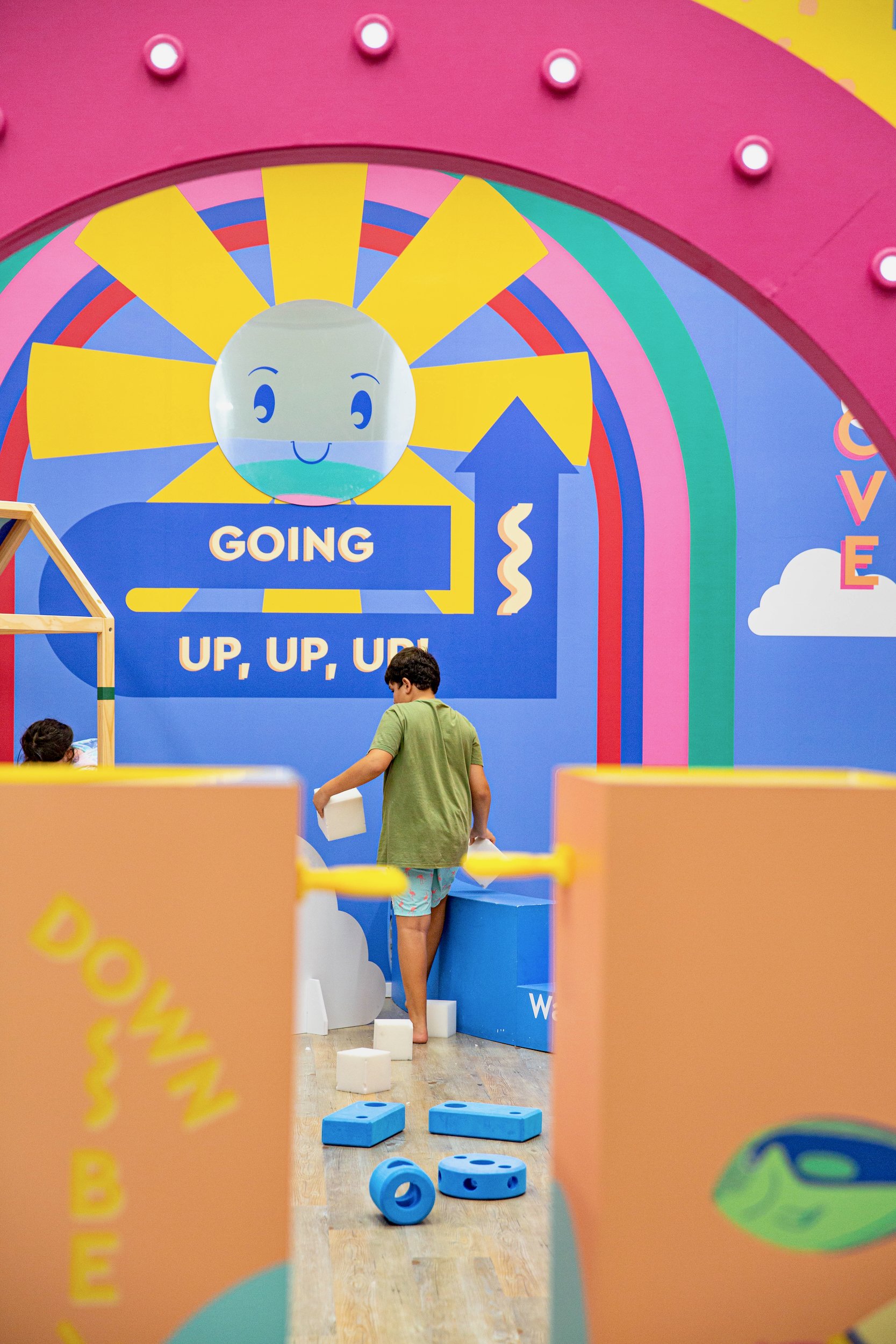
One of the key structural elements in the room that we wanted to repurpose was the portal divider. To us this provided the perfect opportunity to play on a theme of contrast and so Up Above + Down Below was born.
THE MAKING //
Our Up Above room was a whimsical journey to the clouds. A foam pit and our own take on the house from Up featured amongst stylised clouds, rainbows, and sun.
The Down Below room was inspired by Wes Anderson’s The Life Aquatic. Quirky submarine details amongst vibrant sea life scenes were made complete with a pool noodle seaweed maze.
THE SUCCESS //
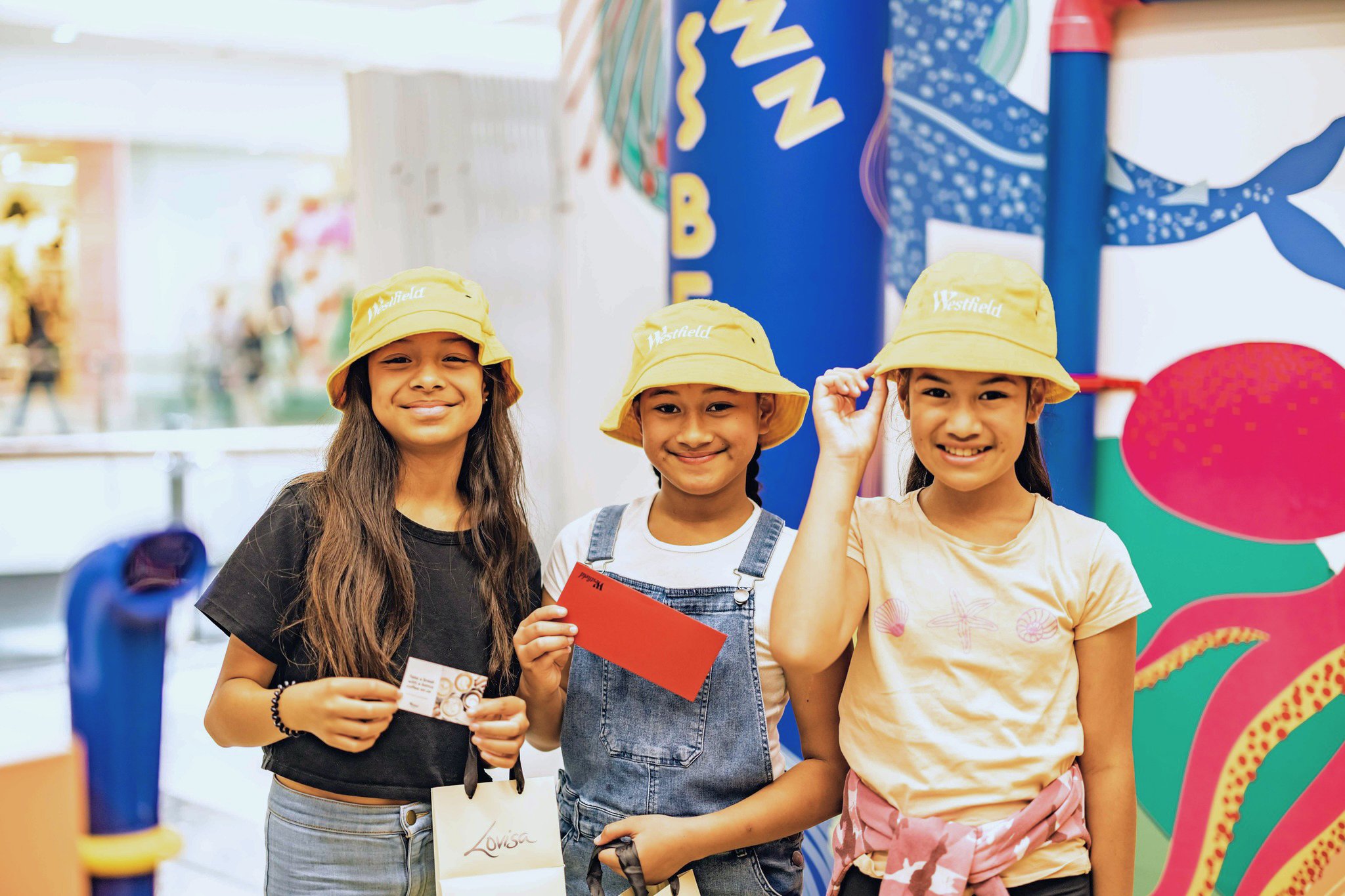
The Up Above + Down Below activation was so well received by St Lukes shoppers that the decision was made for the space to remain open for an extended period.
The play area is always humming with children and families enjoying a moment of imaginative play.
CLIENT //
WESTFIELD ST LUKES
WESTFIELD ST LUKES
CONCEPT, CREATIVE DIRECTION, BRAND IDENTITY, ASSET BUILD, SIGNAGE
RED CREATIVE //
THE SIGN COMPANY, CARPET & RUG CO, MUJINTU, ROLLERCOASTER
VENUE //
SUPPLIERS //


RESULTS FROM THE REAL WORLD //
“I am absolutely thrilled thank you! As you know the space is being so well used we can hear kids playing there all the way from our office. The artwork looks so vibrant and inviting and has injected exactly what the centre needed.”
WESTFIELD ST LUKES


